Client: New York City Football Club
Project Manager: Janine Padilla
New York City Football Club (NYCFC) just wrapped up their much improved-tough ending included-second season. I’m one of thousands of New Yorkers that come from places where soccer is king, so, when we found out the new team in town would be playing in a baseball stadium, we threw a privilege tantrum, then remembered the reason we love this soccer thing is because we get to play it anywhere from dirt to cement, using whatever object we can use a soccer ball.
This was my second season as a fan in the supporters section. It has been a blast watching the team grow and create its own identity. There are the ongoing struggles, like the very confused stadium staff by the energy of a 90-min game compared to a 4-hr pass time; The weird season schedule; and the efforts to get the mix of classic Latin American, European, AND new chants going, but hey! if there’s one thing this city is about–besides letting Mike Pence know what we think of him–is that we are the coolest melting pot in the world.
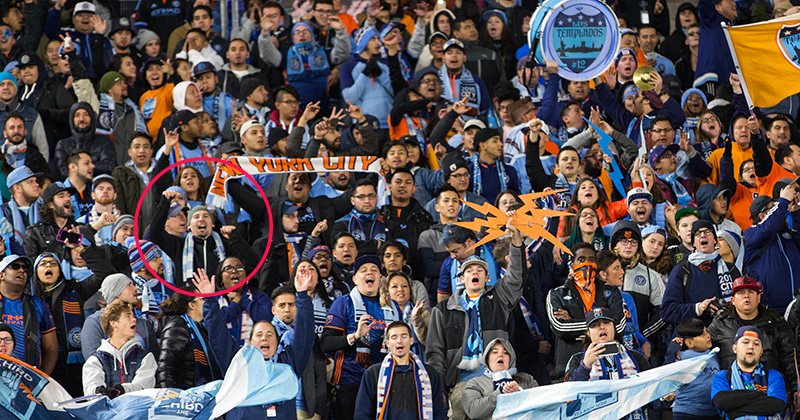 Me in circle, hitting those high notes for El Guaje, Lamps, and L’ Architetto
This was also my second season working with the club on a few things throughout the season:
SEASON EMAILS
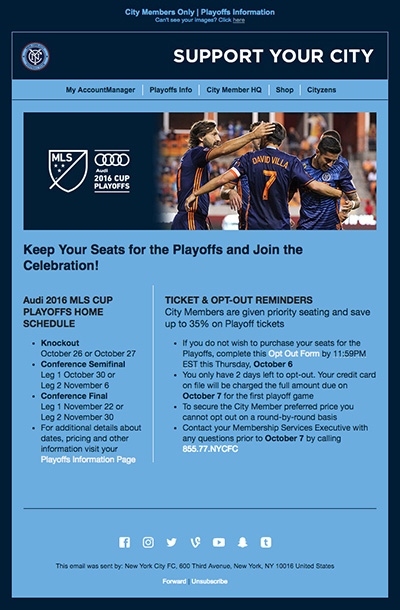
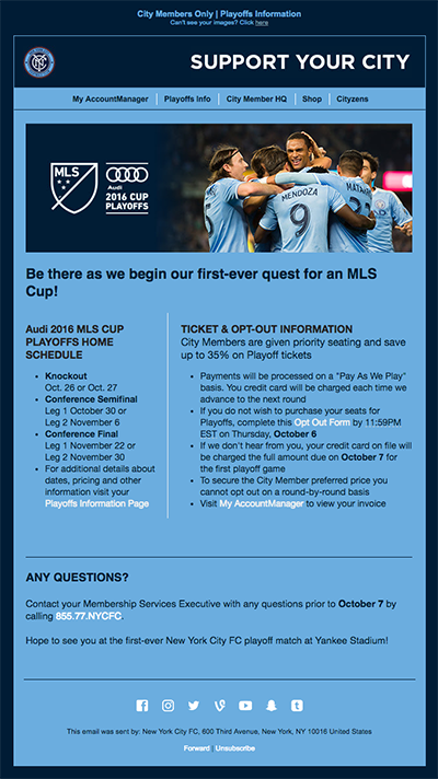
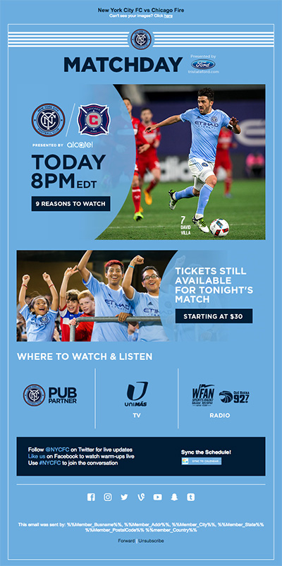
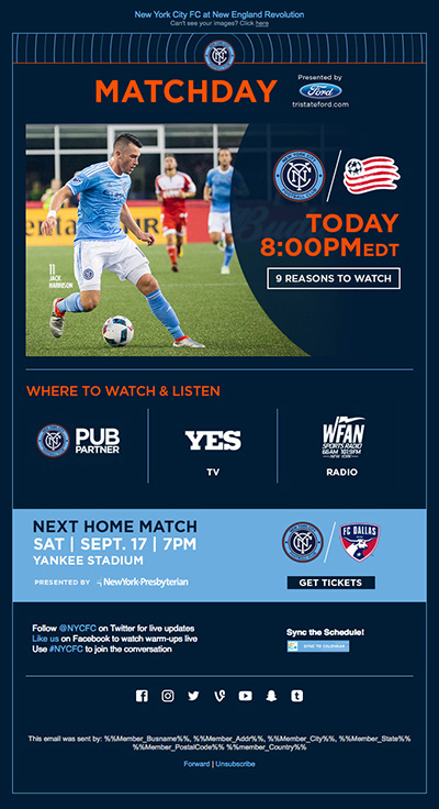
Under the direction of Janine Padilla, designed and built a set of responsive emails for the different campaigns. The goal was to make the code a lot leaner from the previous season (gmail would often clip them because of their size), make them uniform, easy to edit, and targeted to NYCFC’s local and international supporters.
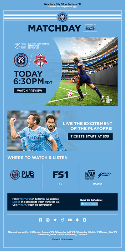

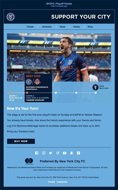
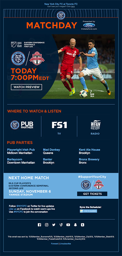





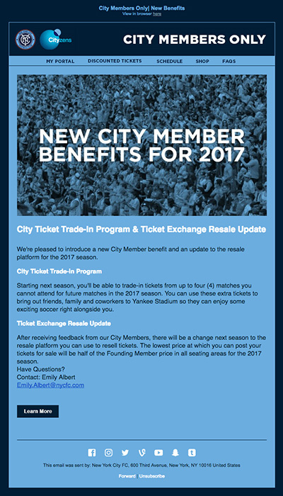

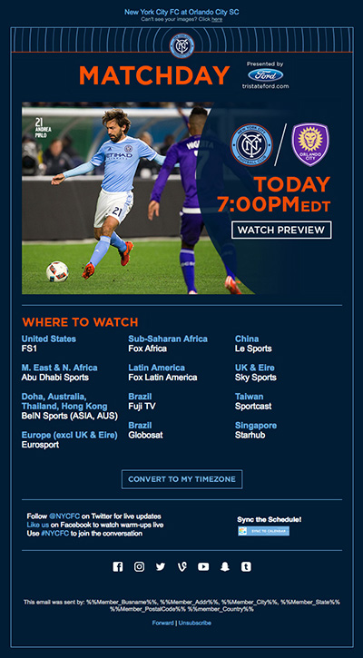

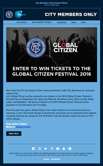

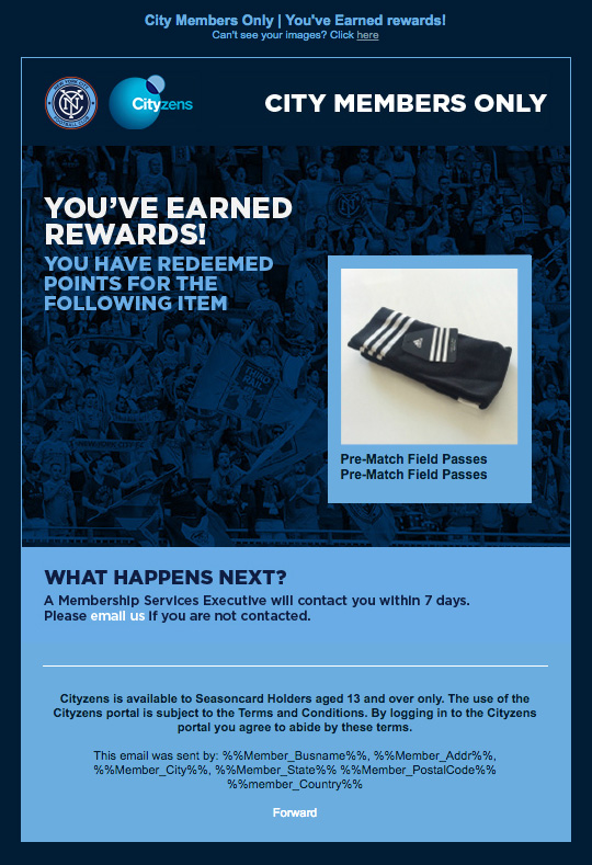
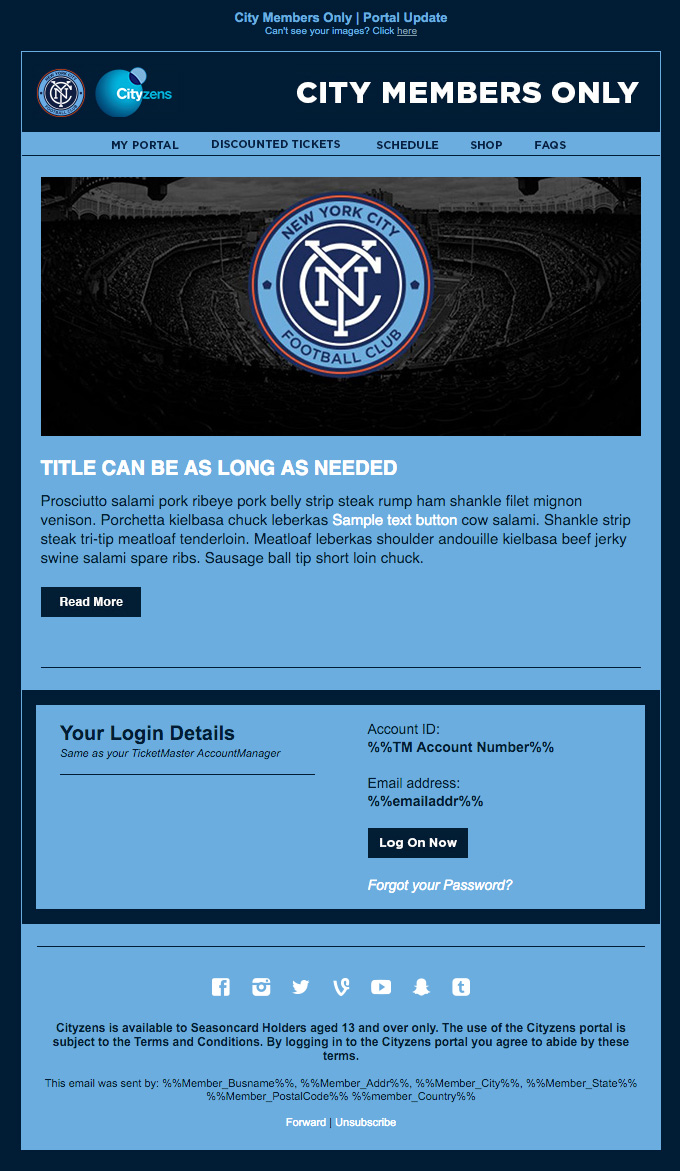


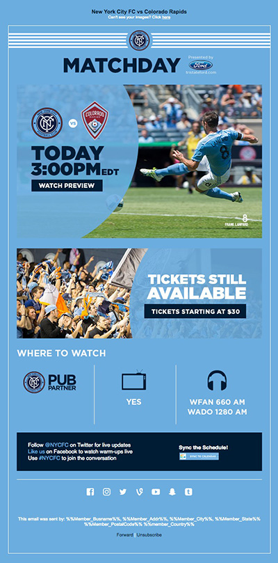

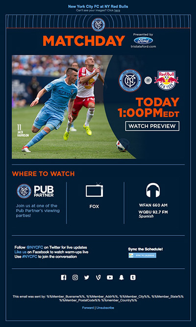

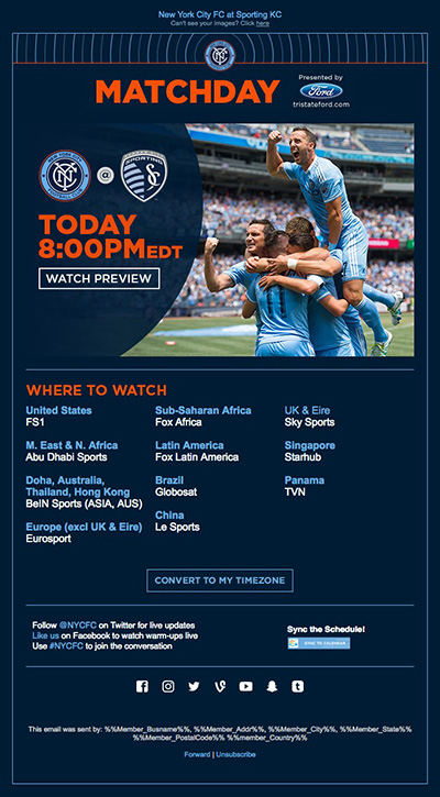
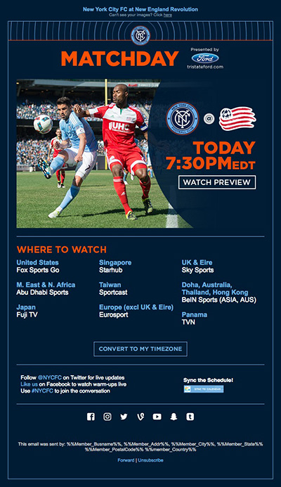


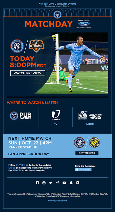


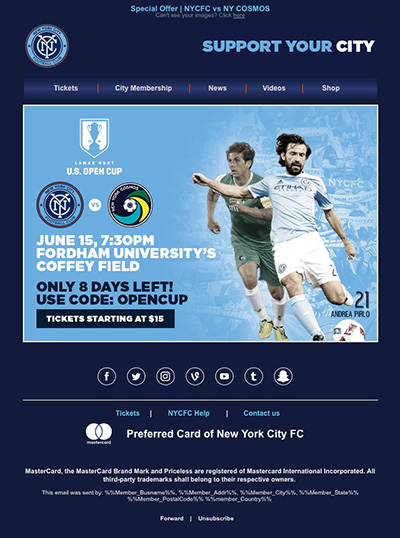

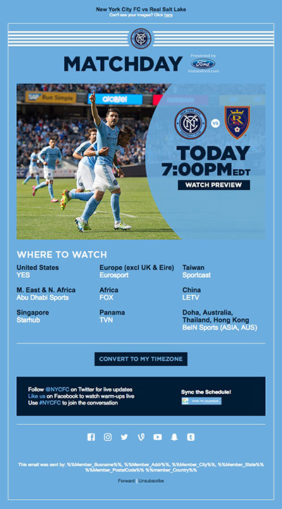


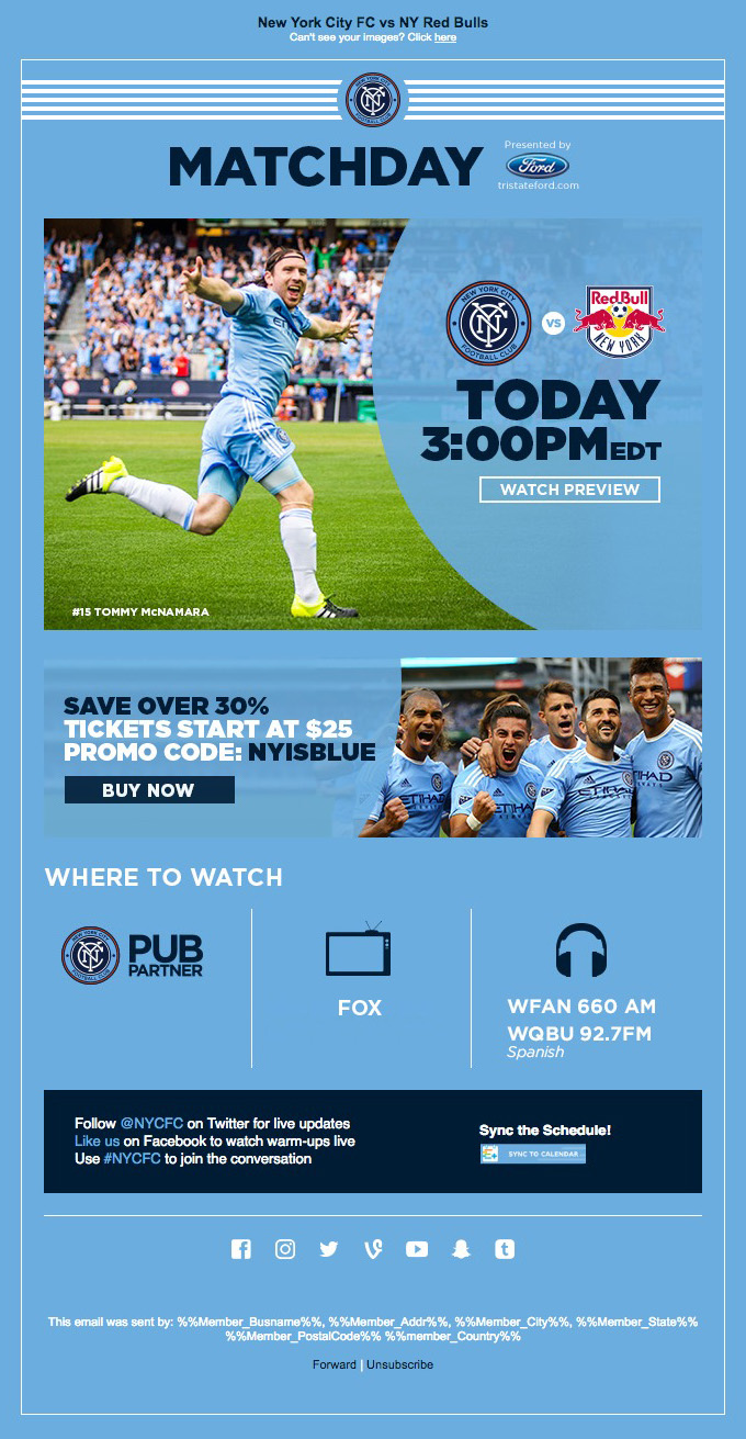


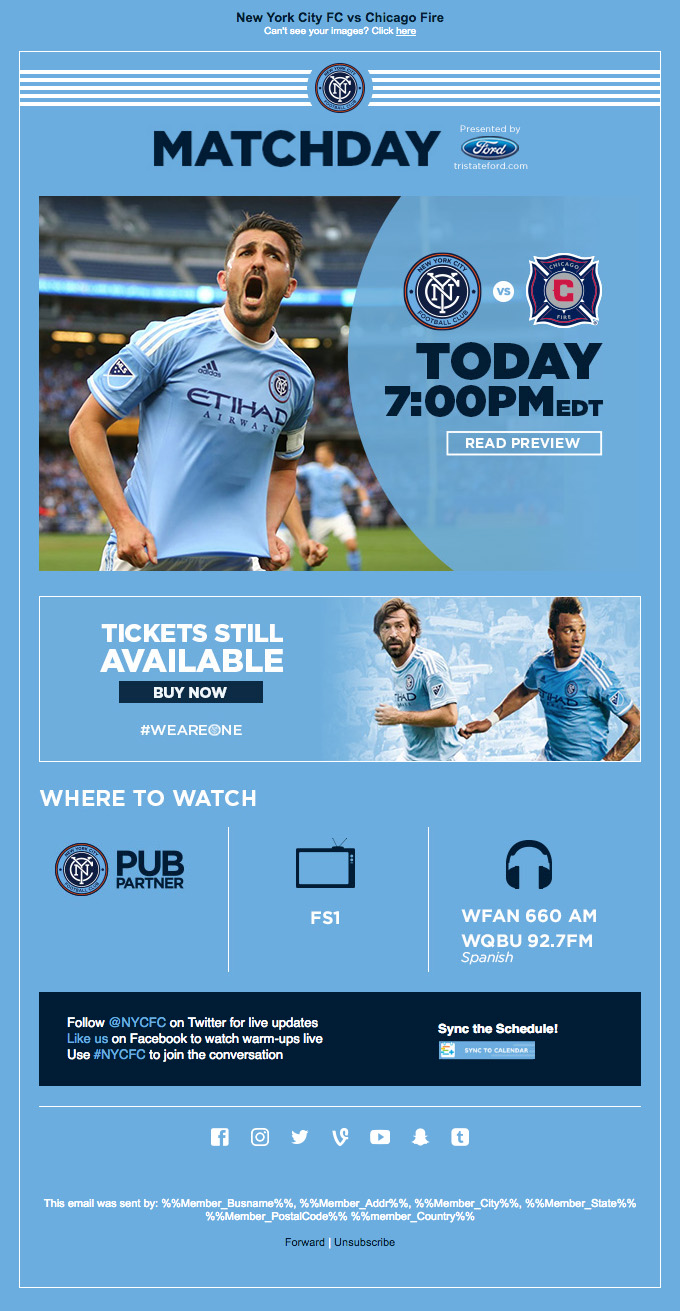
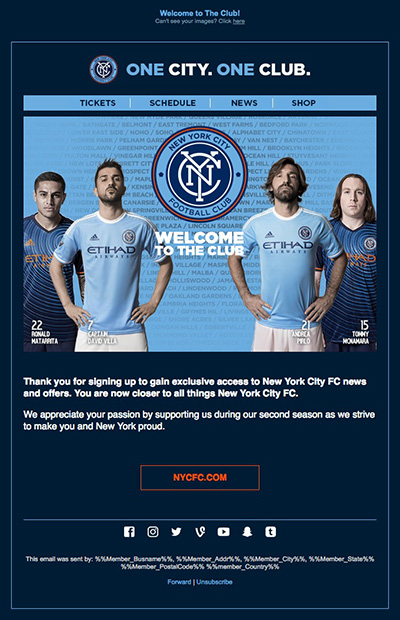


What I learned:
– Litmus is a lifesaver, there are 50+ email clients out there and Litmus has, by far, the fastest and easiest way to test/preview them.

– Dan Denney gave me a bunch of great tips at Squares. One of them is to use this handy Bulletproof email buttons generator. Reliable & and huge time saver!
– Gmail joining the responsive game means it is a good time to stop sending 700px+ wide emails!
If you know some CSS then you can quickly learn @media queries. Here’s is a quick (a bit dirty) simplified version of a responsive email.
See the Pen Simple Responsive Email by Juan Pablo (@jupago) on CodePen.
NYCFC GRAPHICS
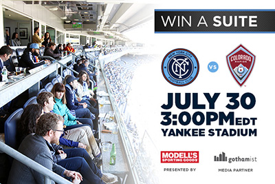
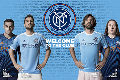
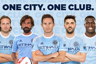
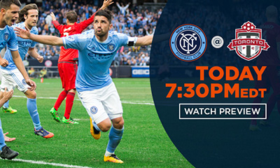
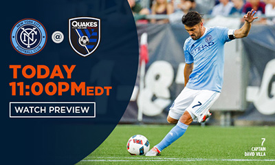
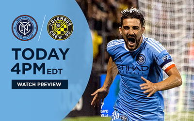
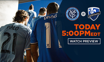
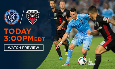
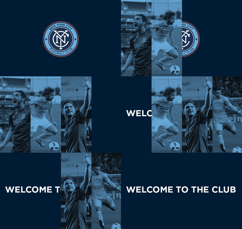
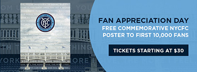
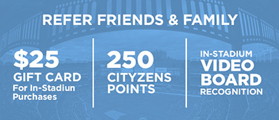
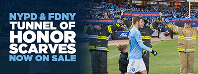
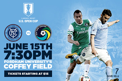
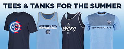
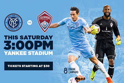
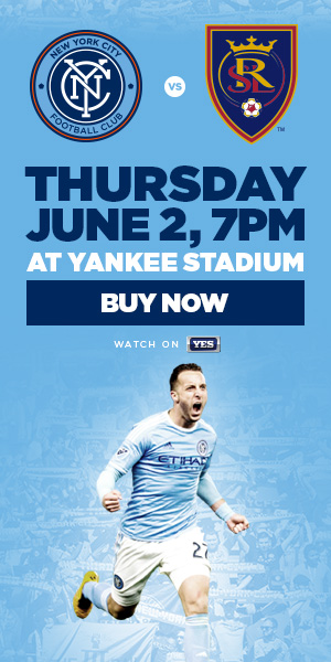
Worked on a mix of different graphics for emails/website/sponsors/social media campaigns. These are fun to do. Mostly because of the size restrictions ad and email vendors provide.
A thing about size… I’m leaving a lot of images out because the page is already a bit heavy. The website is set to serve you a smaller, responsive image if you are on a mobile device. Also imageoptim!! It will reduce the size of your images significantly. Can’t recommend it enough!
*Huge thanks again to Janine for creative direction and Milo Kowalski (NYCFC’s designer) for the styleguides and those time consuming silos!

